KEB Hana 1Q Bank Brand Identity
Launched in 2015, 1Q Bank was introduced by KEB Hana Bank through its Canadian branch as a mobile-only banking platform, marking the first global mobile banking initiative among Korean financial groups. The project was driven by the ambition to enter the global mobile banking market at an early stage, when the space was still relatively open.
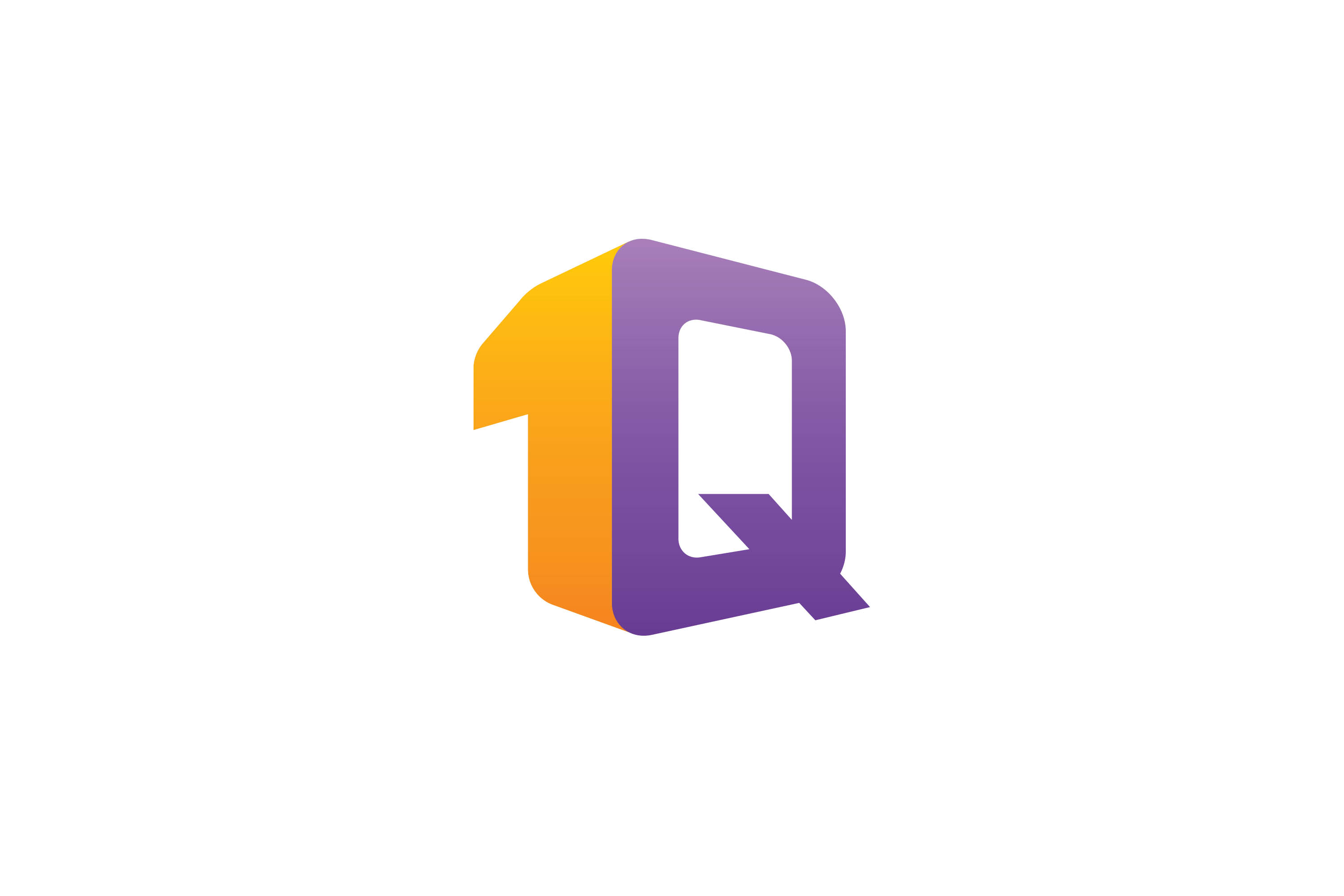
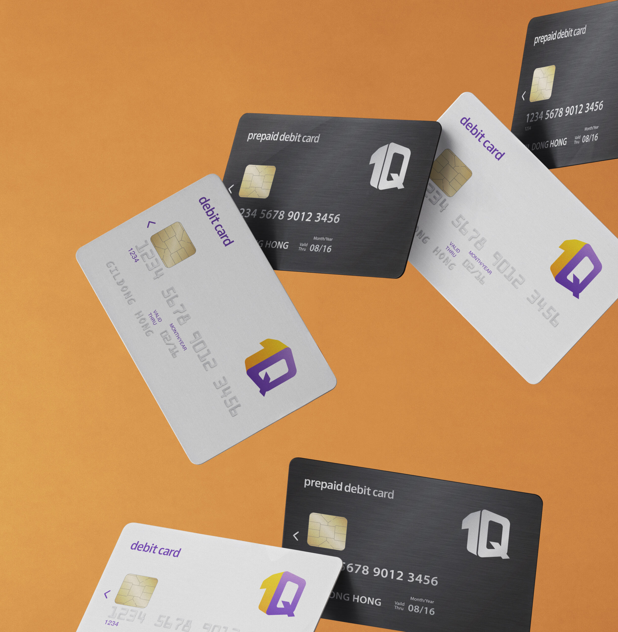
Built around the concept of Simple & Trusted, the brand identity features a logotype in which the characters “1” and “Q” lean toward each other, symbolizing reliability and balance. Originally developed for overseas markets, the 1Q brand was later expanded to Korea in 2016 following positive feedback from Canadian users and international students.
My contributions to the project included application system design and the development of brand identity guidelines.
2015년, KEB하나은행은 국내 금융그룹 최초로 캐나다 지부를 통해 모바일 전용 뱅킹 플랫폼 1Q Bank를 선보였습니다. 핀테크가 막 부상하던 시점, 글로벌 모바일 뱅킹 시장이 아직 포화되지 않은 기회를 앞세워 해외 시장을 먼저 선점하고자 한 프로젝트였습니다.
Simple & Trusted를 콘셉트로, 숫자 1과 알파벳 Q가 기대고 있는 형태의 로고타입을 중심으로 아이덴티티를 구축했습니다. 당시 금융 브랜드의 공식이었던 ‘신뢰 = 무게감’과는 반대로, 가볍고 직관적인 형태와 선명한 컬러를 택했습니다. 캐나다 현지에서 긍정적인 반응을 얻으며 2016년 국내 시장으로 확대 적용됐습니다.
돌아보면 당시의 방향은 시대의 흐름과 맞닿아 있었습니다. 오늘날 모바일 뱅킹 브랜드들이 복잡한 금융 정보를 단순하고 친근한 언어로 풀어내는 방향으로 수렴하고 있다는 점에서도 그렇습니다. 다만 지금이라면 브랜드 시스템의 완성도뿐 아니라, 그 아이덴티티가 실제 서비스 경험 안에서 어떻게 일관되게 구현되는지까지 함께 설계했을 것입니다.
Year
2014
Client
Hana Financial Group
Collaborators
Uzin Hwang
Jinyoung Lee