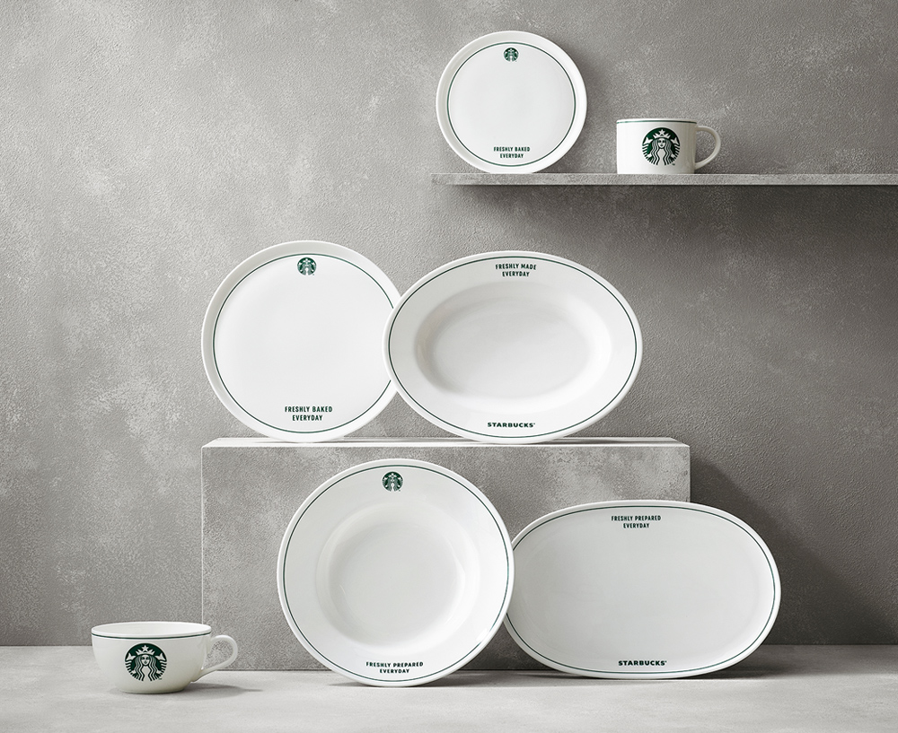
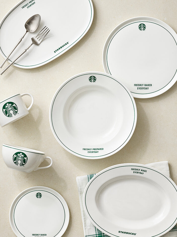
Greenline Tableware Series
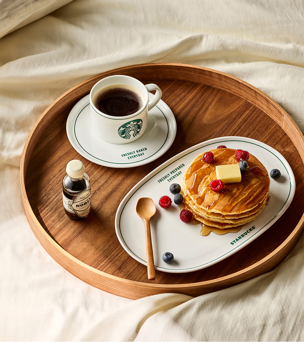
This Greenline tableware series was designed using Starbucks’ signature green line as a minimal visual device, allowing the brand identity to be expressed in a subtle and refined way. By reducing decorative elements and focusing on proportion and placement, the design achieves a timeless, classic look that remains appealing through long term use.
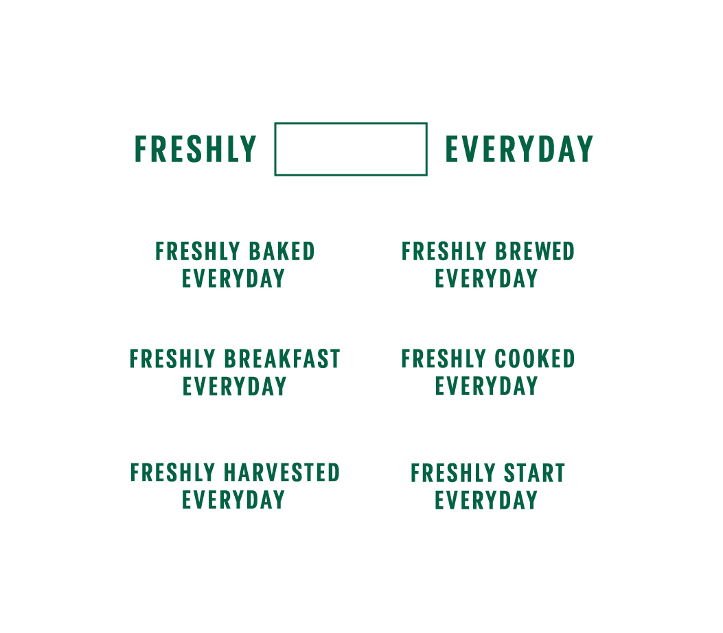
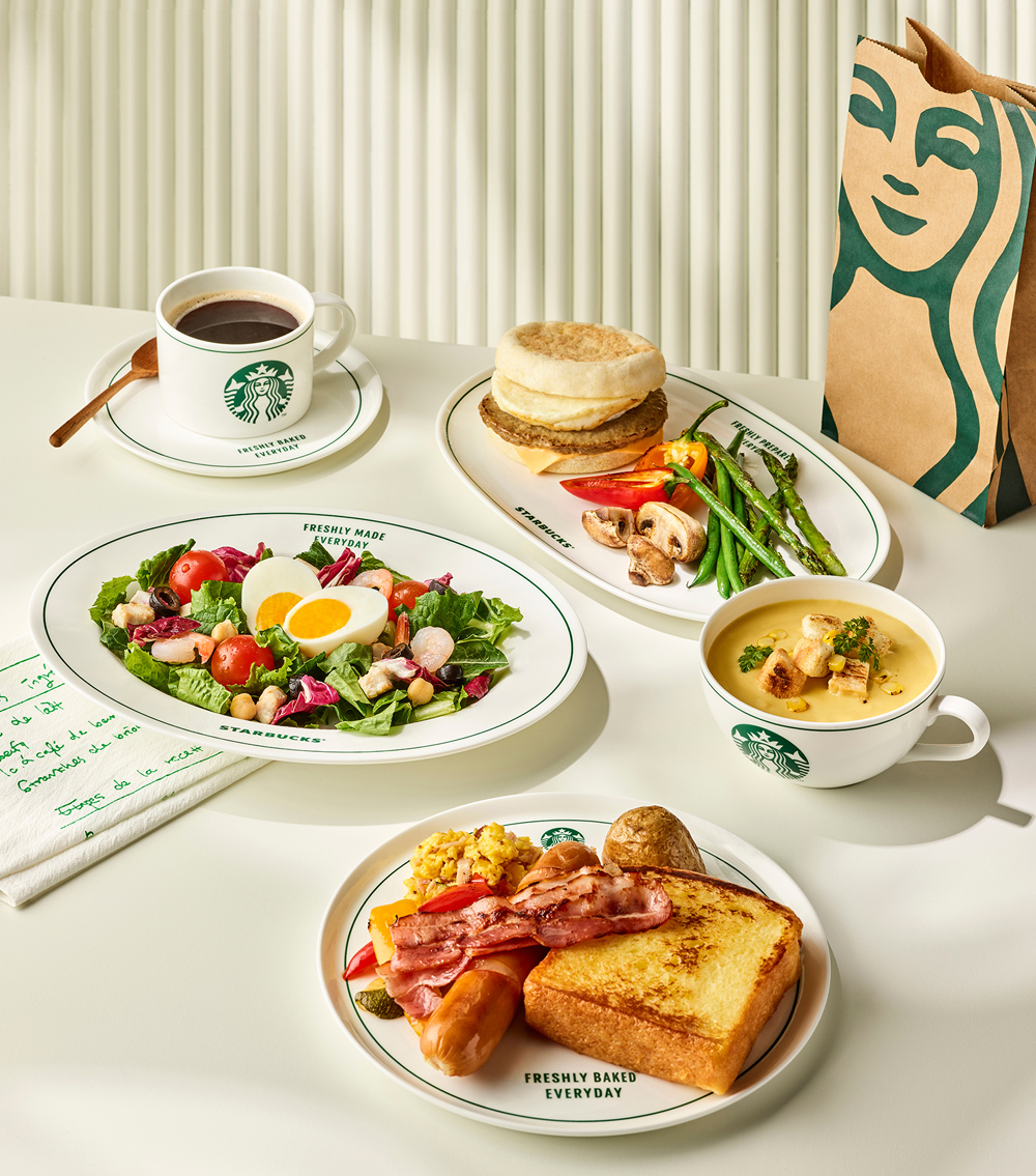
A flexible copy system built around the phrase structure “Freshly ~ Everyday” was developed to adapt across different product categories. The typography and layout were carefully tuned to maintain rhythm, personality, and consistency across applications, turning each piece into a small but effective brand communication surface.
Originally planned as an online exclusive product to help drive traffic and conversion in the brand’s e commerce channel, the collection exceeded initial sales expectations and contributed to the broader expansion of the Starbucks tableware category.
스타벅스를 상징하는 그린 컬러 라인을 최소한의 요소로 정제해 테이블웨어 디자인에 적용했습니다. 과도한 그래픽 없이도 브랜드 아이덴티티가 자연스럽게 드러나도록 구성해, 오래 사용해도 질리지 않는 클래식한 인상을 목표로 했습니다.
“Freshly ~ Everyday” 구조의 문구 시스템을 개발해 제품 카테고리별로 유연하게 확장 가능하도록 설계했으며, 반복 노출 시에도 리듬감과 캐릭터가 유지되도록 타이포그래피 밸런스를 조정했습니다. 이를 통해 단순한 식기류가 아닌 브랜드 메시지를 담는 커뮤니케이션 요소로 기능하도록 했습니다.
본 제품은 자사 온라인몰 활성화를 위한 전용 상품으로 최초 기획되었으며, 초기 판매 성과가 기대치를 상회하면서 스타벅스 테이블웨어 카테고리 전반으로 확장되는 계기를 만들었습니다.
Year
2023
Collaborators
Bella Yoo