Saenggwabang
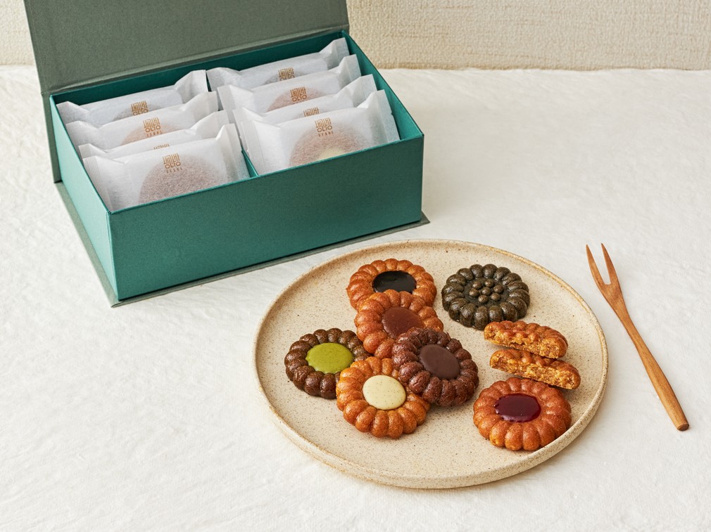
This brand renewal project reinterprets traditional Korean yakgwa as a premium gift dessert, inspired by Saenggwabang, the royal confectionery kitchen of the Joseon era.
The objective was to retain the ceremonial and symbolic qualities of traditional sweets while creating a brand and packaging experience suited to the modern gift market.
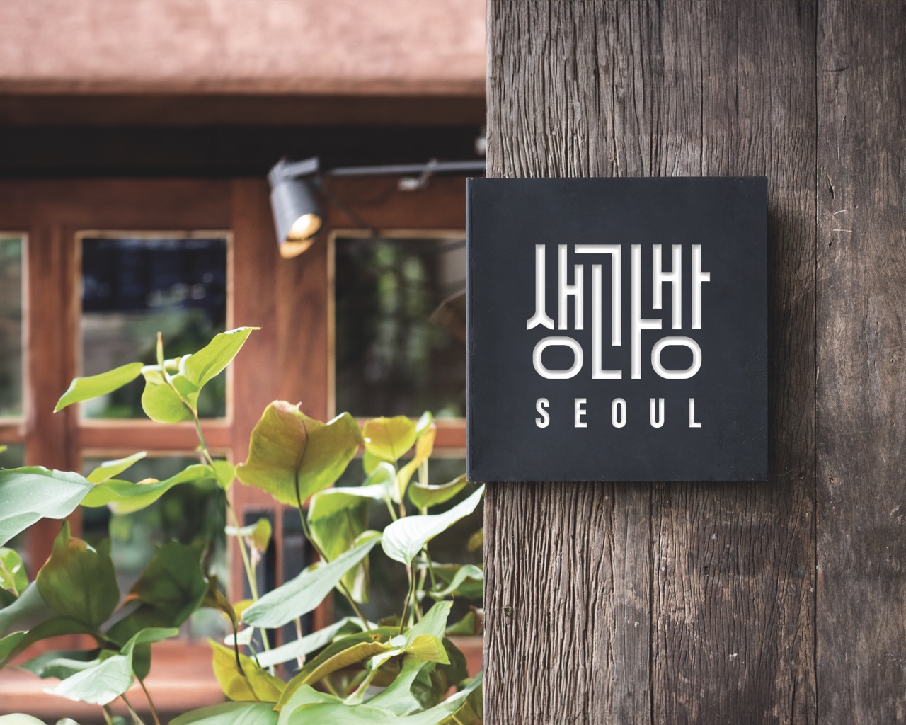
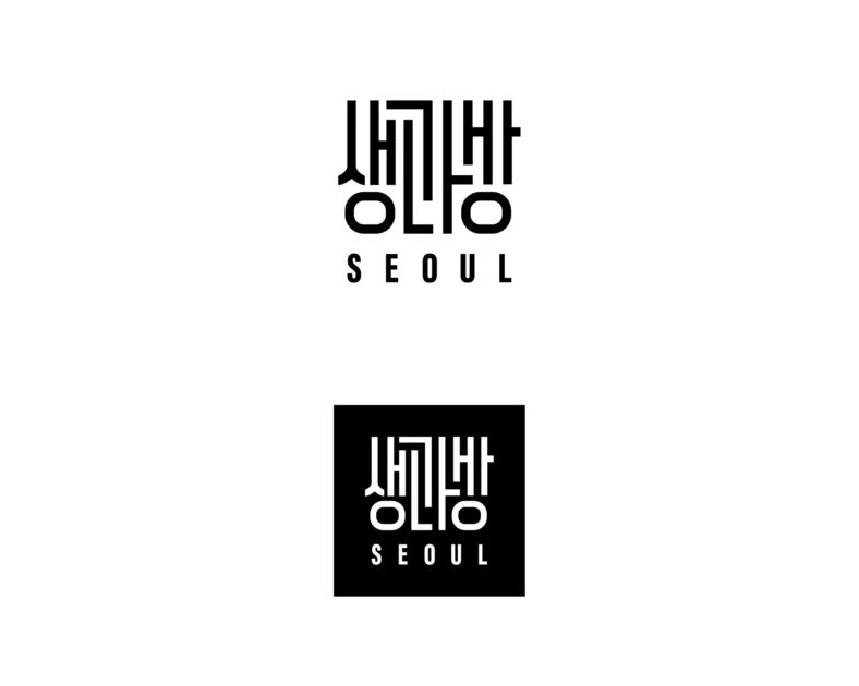
The logo was developed based on the motif of traditional Korean seal marks, commonly found in furniture, gift elements, and classical artwork.
It was designed to emphasize the geometric and structural characteristics of Hangul letterforms, allowing the identity to be visually distinctive and recognizable even to international audiences.
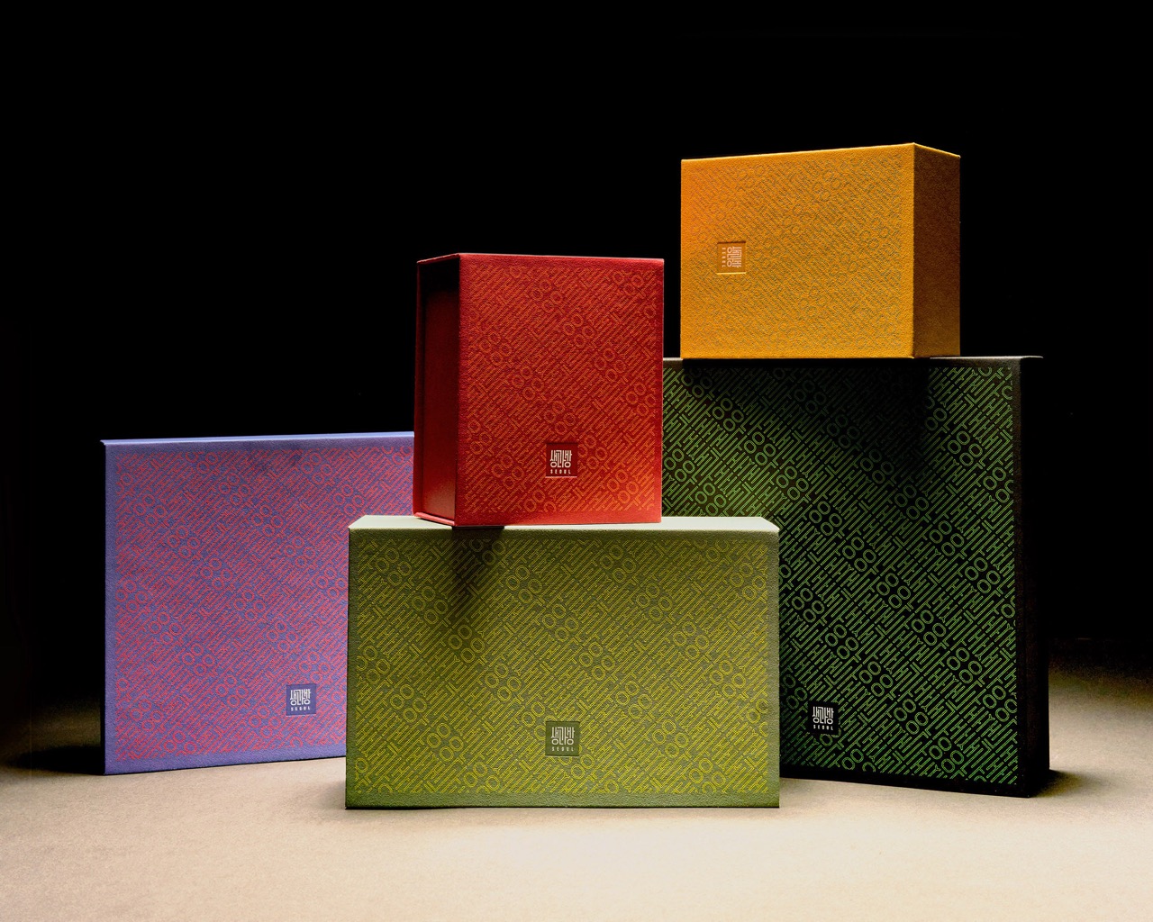
The project covered the full visual system including BI, packaging, shopping bags, and brand guidelines. Rather than replicating traditional elements literally, the design reinterprets them through contemporary composition and proportion.
Premium positioning and gift presentation were treated as key criteria throughout the design system.
조선 왕실의 별식을 만들던 전각 ‘생과방’에서 영감을 받아, 전통 약과를 프리미엄 선물 디저트로 재해석한 브랜드 리뉴얼 프로젝트입니다.
전통 디저트가 지닌 격식과 상징성은 유지하면서, 현대 선물 시장에 어울리는 브랜드 인상과 패키지 경험을 구축하는 데 초점을 맞췄습니다.
로고는 전통 가구, 선물 포장, 회화 작품 등에서 볼 수 있는 인장(Seal) 형태를 모티브로 개발했습니다.
한글 조형이 가진 직선적이고 기하학적인 구조가 잘 드러나도록 설계하여, 해외 소비자가 보더라도 시각적으로 명확한 아이덴티티로 인식될 수 있도록 디자인했습니다.
프로젝트 전반에 걸쳐 BI, 패키지 디자인, 쇼핑백, 브랜드 가이드까지 시각 체계를 재정비했으며, 전통 요소를 직접적으로 재현하기보다 현대적인 구성과 비율로 재해석하는 방향으로 디자인을 전개했습니다.
프리미엄 선물 브랜드로서의 완성도와 전달력을 중심 기준으로 설정해 전체 경험을 설계했습니다.
Year
2024