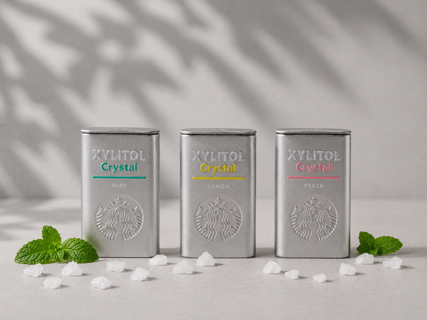
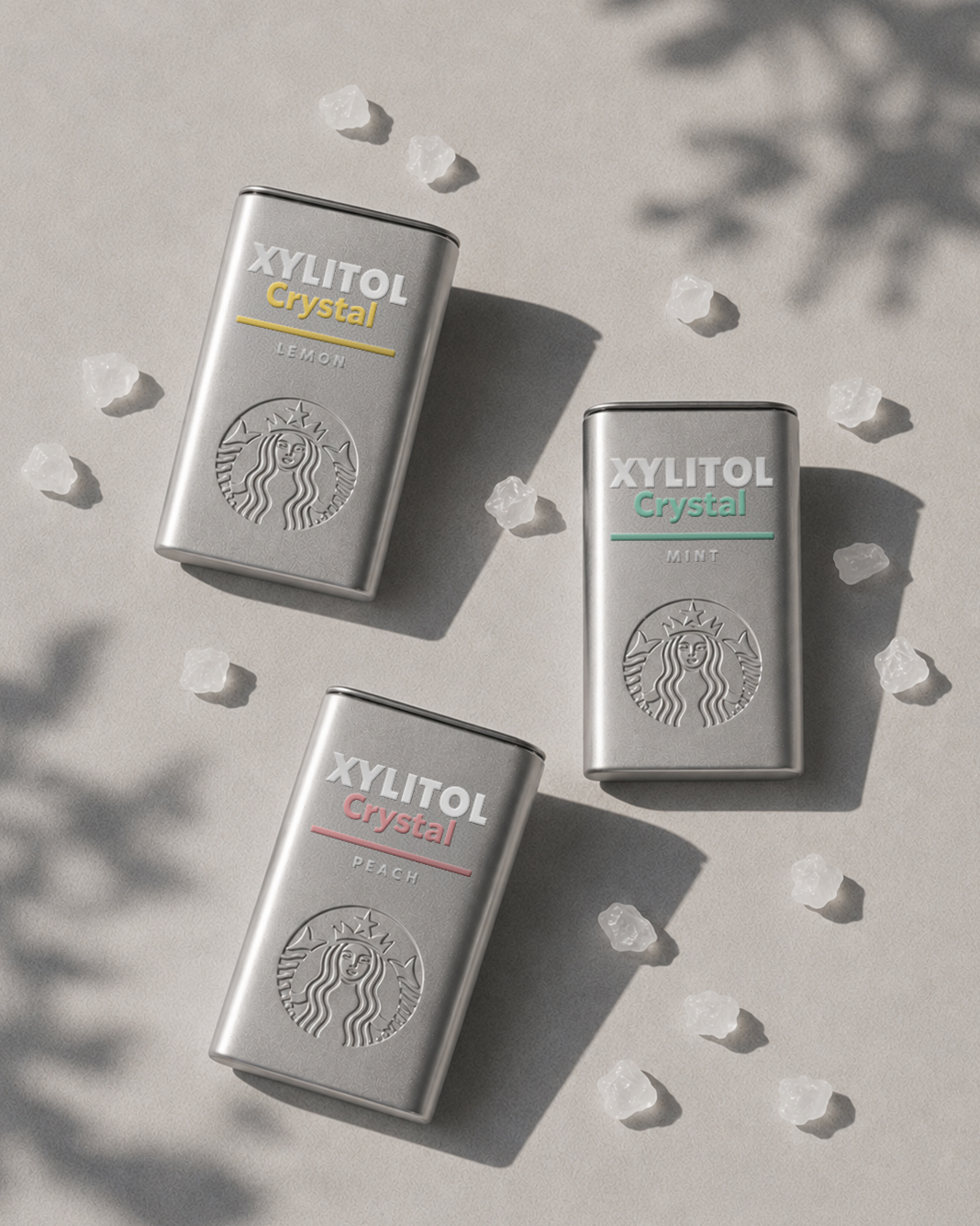
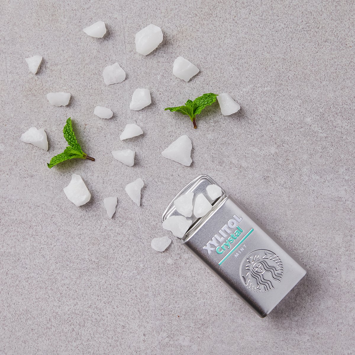
XYLITOL Crystal Package Design
The packaging was designed to express the clean and refreshing character of xylitol through a minimal graphic system and a flavor-based color identity. A simple layout and color coding provide clear product differentiation while maintaining a consistent visual language across the range.
To encourage repeated everyday use, the product was designed in a reusable hinged metal tin case instead of conventional disposable packaging. The durable metal container was intended to be conveniently carried and reused in environments such as cars, bags, or desks, extending the product experience beyond the candy itself.
The range was initially launched in Mint and Lemon flavors, and later expanded with Peach following a positive market response. Originally introduced in 2020, the product remains on the market today.
자일리톨의 깨끗하고 시원한 이미지를 직관적으로 전달하기 위해 미니멀한 그래픽 시스템과 플레이버별 컬러 아이덴티티를 적용했습니다. 단순한 레이아웃과 컬러 코딩을 통해 제품 간의 구분성을 높이는 동시에 일관된 브랜드 경험을 구축했습니다.
패키지는 반복적인 사용과 휴대성을 고려하여 재사용 가능한 메탈 틴 케이스 형태로 디자인했습니다. 내구성이 뛰어난 힌지형 틴 케이스를 적용해 차량, 가방, 데스크 등 다양한 일상 환경에서 편리하게 사용할 수 있도록 했으며, 소비 이후에도 지속적으로 사용할 수 있는 패키지 경험을 제안했습니다.
초기에는 Mint와 Lemon 두 가지 플레이버로 출시되었으며, 긍정적인 시장 반응을 바탕으로 Peach 플레이버를 추가 개발하여 라인업을 확장했습니다. 2020년 출시 이후 현재까지 판매되고 있는 제품입니다.
Year
2020
Collaborators
Youngha Park