
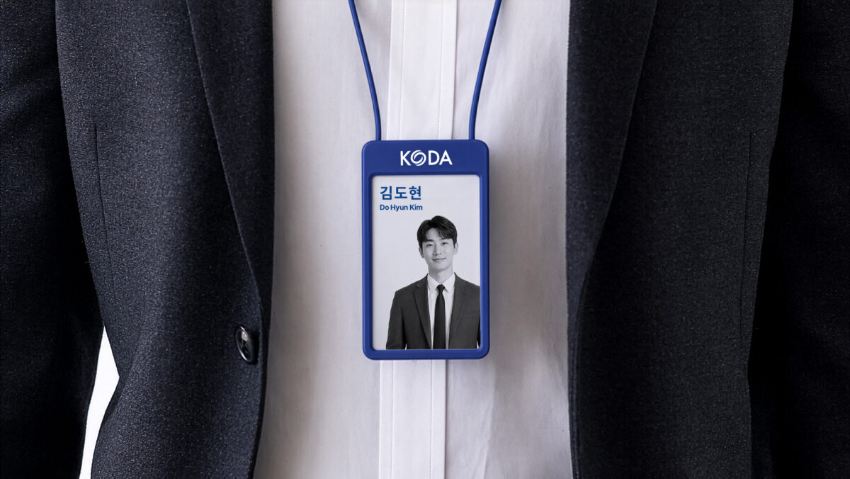
KODA CI Renewal
Established in 2005 as a statutory body under Korea’s Ministry of Land, Infrastructure and Transport, KODA represents the country’s real estate development industry, with more than 940 member companies today. Marking its 20th anniversary in 2025, the association was renamed the Korea Developers Association and unveiled a fully renewed corporate identity to declare its vision for the next twenty years.
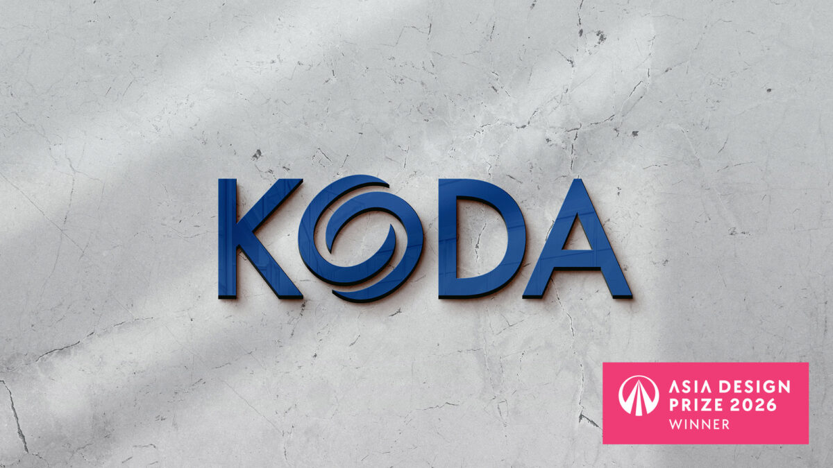
The new logotype is set in a solidly built, medium-weight typeface that conveys the trust, dynamism and youthful momentum of the industry, its perfectly balanced forms expressing a shared future of harmony and mutual growth. At its center, the symbol reinterprets the taegeuk — the emblem of Korea itself — as an arrangement of yin and yang that signifies change, creation and progress. It evokes the cycle and coexistence of architecture, people and nature, capturing the essence of the developer as one who shapes cities and culture in balance. The letter “O” is drawn so that it can also stand alone as an independent mark, carrying the association’s outlook toward its next chapter.
The renewed identity was recognized with an award at the Asia Design Prize 2026.
한국부동산개발협회(KODA)는 2005년 국토교통부 산하 법정단체로 출범해 대한민국의 부동산 개발 산업을 대표하는 단체로, 현재 940여 개 회원사를 두고 있습니다. 협회는 창립 20주년을 맞아 사명을 *한국디벨로퍼협회(Korea Developers Association)*로 변경하고, 앞으로의 20년을 향한 비전과 함께 새롭게 개편한 CI를 공개했습니다.
새로운 로고타입은 견고함이 느껴지는 Medium 두께의 서체로 산업의 신뢰와 역동성, 젊음과 변화를 상징하며, 완벽한 균형을 이루는 형태를 통해 공동의 미래와 조화, 상생의 가치를 담아냅니다.
심볼은 대한민국을 대표한다는 상징성을 담아 태극 문양을 바탕으로 제작되었으며, 음과 양의 배열로 변화와 생성, 발전을 의미합니다. 이는 건축과 사람, 자연의 순환·공존·상생을 나타내는 동시에, 도시와 문화를 창조하며 조화를 이루는 디벨로퍼의 본질과 앞으로의 비전을 표현합니다. 또한 알파벳 ‘O’를 분리해 독립적인 심볼로도 활용할 수 있도록 설계했습니다.
본 프로젝트는 Asia Design Prize 2026에 출품되어 수상하였습니다.
Year
2025
Collaborator
YounghaPark Studio