
e편한세상 Brand Renewal
Launched in 2000, e편한세상 is one of Korea’s pioneering residential brands to introduce brand thinking to the apartment market — reframing the idea of a home from something to buy into somewhere to live.
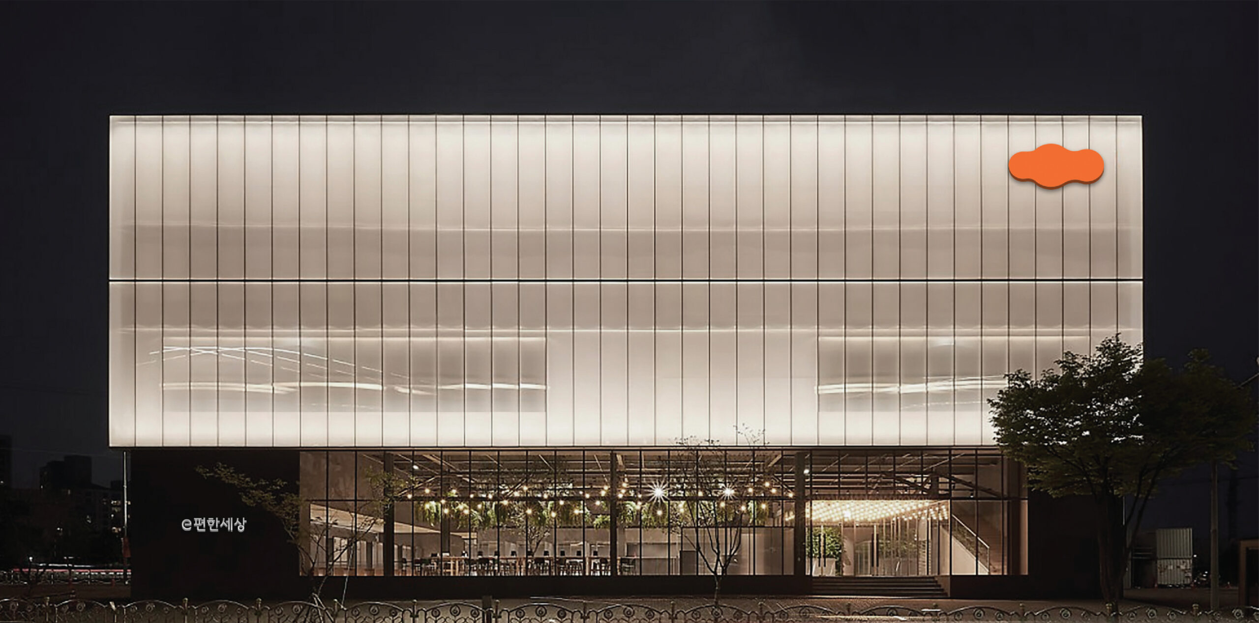
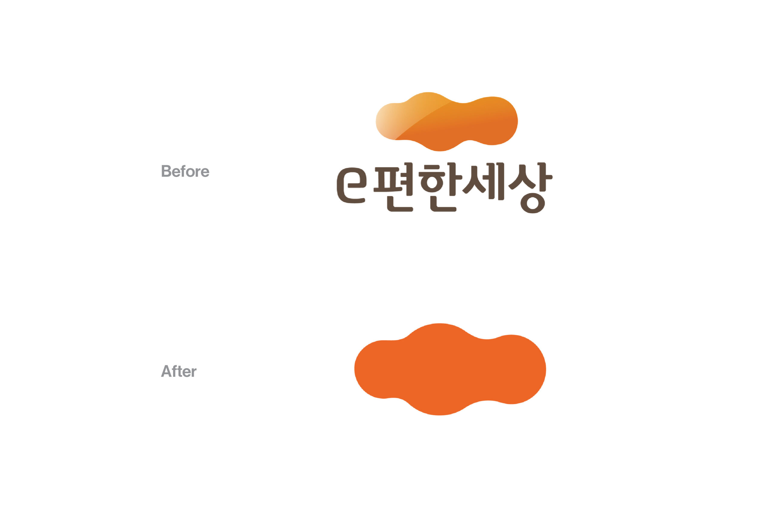
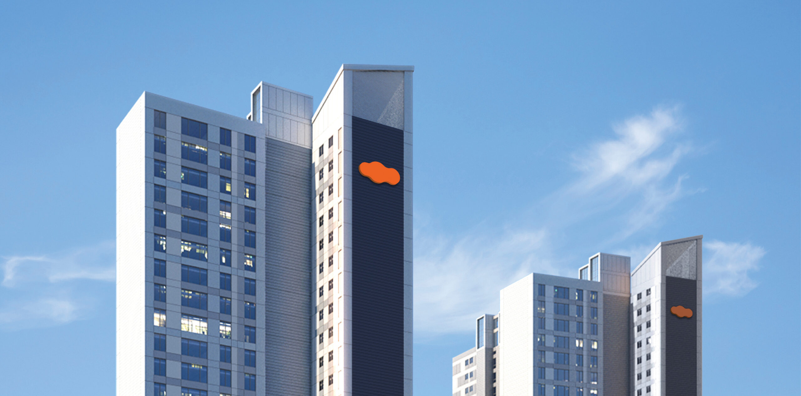
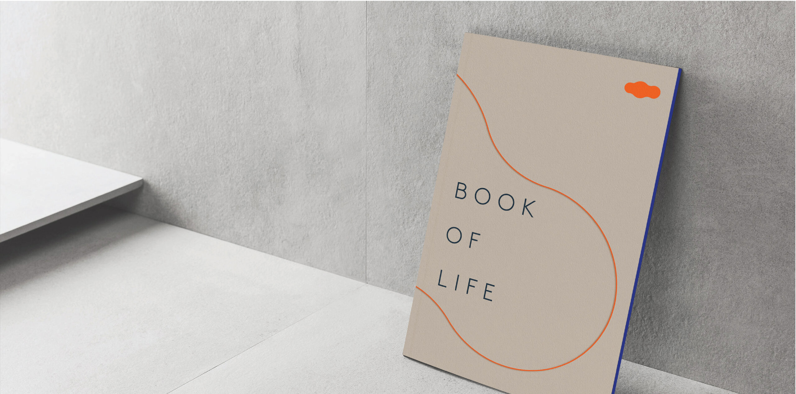
On the occasion of the brand’s 20th anniversary, the renewal project set out to preserve what had been built over two decades while articulating a new vision for premium residential living. Rather than creating a new symbol, the project began with what the brand already owned: the orange cloud, a shape deeply familiar to consumers. The logo was stripped away, and the symbol was given the space to carry the brand on its own — a bold direction for a Korean residential brand, and one that significantly expanded the symbol’s presence and memorability.
2000년 런칭한 e편한세상은 아파트에 브랜드 개념을 도입한 국내 1세대 주거 브랜드입니다. ‘사는 것(buying)’이 아닌 ‘사는 곳(living)’으로 바라보는 관점을 처음 제안한 브랜드 중 하나였습니다.
브랜드 20주년을 맞아 진행된 이번 리뉴얼의 출발점은 새로운 것을 만드는 것이 아니라, 20년간 쌓아온 자산을 발견하는 것이었습니다. 소비자에게 이미 각인된 오렌지 구름 심볼을 재발견해, 로고 타입을 걷어내고 심볼만으로 브랜드를 커뮤니케이션하는 과감한 방향을 설정했습니다. 국내 아파트 브랜드에서 처음 시도되는 접근으로, 심볼의 확장성과 상징성을 높여 브랜드가 보다 아이코닉하게 기억되도록 하는 데 집중했습니다.
Year
2029
Collaborators
Uzin Hwang, Hyangmee Jang,
Hyeri Jeon, Jooyoung Park